


After putting lots of effort into capturing and processing an image you’re finally ready to put it online or send it off to the printer, excited to share the latest piece of art you’ve created. But then, to your disappointment, the image looks nothing like what it did in your editing software. The colors are all wrong!
Does this sound familiar? Don’t worry. We’ve all been there. Luckily, there’s probably nothing wrong with neither the image or printer. It’s simply been assigned the wrong color space.
Knowing which color space is the best to use can be quite hard and it’s something I struggled with when getting into photography myself.
This article is a guide to help you understand the different color spaces and what they are best used for so that you don’t have to go through the same pitfalls as I did.
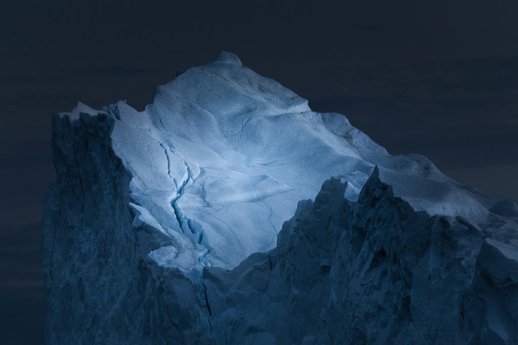
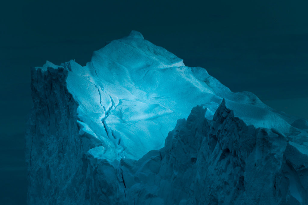
The example above shows just how big the difference can be when saving or working in the wrong color space. In the second image, an sRGB image has been opened in ProPhoto RGB and looks nothing like the original.
What are color spaces?
First of all, what is a color space?
Put simply, it’s the range of colors that can be produced in an image.
There are a handful of color spaces available for you to choose between, all of which have a variety in the gamut of colors (color gamut is the range of colors that a device is able to produce)
The most common color spaces are sRGB, Adobe RGB and ProPhoto RGB; all having their pros and cons. I know this can be a bit confusing so let’s take a closer look at them:
sRGB
sRGB stands for standard Red, Green and Blue and was created by HP and Microsoft in 1996 for monitors and printers.
While it’s the color space with the smallest range of colors, it’s surprisingly enough still the most used and supported.
In fact, sRGB is the preferred color space for any web use (yes, this includes social media!)

Some print labs will also ask for images in the sRGB color space, depending on their printing process. This is something to consult them with but more about that in a bit.
Pros with sRGB
- Suitable for web
- Standard color space for most web
Cons with sRGB
- Smaller color space so colors are less vibrant
- Cannot be converted to the larger color spaces Adobe RGB or ProPhoto RGB
Adobe RGB
Adobe RGB was created by Adobe Systems Inc. in 1998 to improve the gamut range of sRGB.
It’s a larger color space that’s commonly used for professional printing (as these printers allow you to work with a wider range of saturated colors)
A benefit of using Adobe RGB is that you can always convert to an sRGB file when publishing the image online. This is done since the Adobe RGB color profile is too large for the web, resulting in your photos looking a bit de-saturated and dull.
Pros with Adobe RGB
- Larger color space which means more vibrant colors
- Usually the best space for printing
- Can covert so sRGB
Cons with Adobe RGB
- Too large of a color space to be rendered on the average screen
- Must be converted to sRGB for web
ProPhoto RGB
ProPhoto RGB is the newest kid on the block and has a larger range of colors than the previous two, even larger than what our eyes are able to see.
Kodak created this color space with the intention of creating a wider gamut alternative for photographic prints. The flipside, though, is that only very specific high-end inkjet printers are able to print ProPhoto RGB files.
To be able to use its full potential you need to shoot in RAW and edit in 16-bit. If you don’t edit your files in 16-bit it creates posterization in the photo. Remember that this also needs to be converted to an sRGB file when displayed on the web.
Pros with ProPhoto RGB
- Largest color space
- Can be converted to sRGB and Adobe RGB
Cons with ProPhoto RGB
- No monitors can display the full potential ProPhoto RGB
- Very few to no printers can print a ProPhoto RGB file
- 8-bit files will have posterization
- Must be converted to sRGB for web
Which color space should I photograph in?
If you are shooting in RAW it makes no difference what color profile you set your image to because a RAW file is an uncompressed file that has no color space until it’s processed.
Setting the in-camera color profile when photographing in RAW only affects the image preview but not the file itself.
Those of you who are shooting in JPEG should always use the biggest color space available. Remember, you can always change it to a smaller one during post-processing.
This means you should set your camera to capture images in Adobe RGB.
Now you might be asking: Jillian, you said to always shoot in the largest color space, which I now know is ProPhoto RGB. So, why shouldn`t I set my camera to capture that?
That’s a valid question. The reason is quite simple: ProPhoto RGB is not an available option when shooting .jpg! The largest available color space for these files is Adobe RGB.
Exactly how to change the color space in your camera varies from model to model but it’s typically found within the general camera settings. I recommend consulting your camera manual for further instructions.
Which color space should I process in?
Now that you’ve set your camera to shoot in the correct color space (which only really matters if you’re photographing JPEGs), the next question is which color space you should edit your images in.
For those of you who photograph in RAW formats, this is the more important question as it affects how well your images look on web or print.
Let’s get straight to it: the best color space to process your photos in is ProPhoto RGB.

As you might remember by now, this gives you the largest gamut of colors and it can also be converted to either sRGB or Adobe RGB.
Again, make sure you’re processing your image as a 16-bit file or you may get some posterization (colors becoming pixelated or you get banding).
Note: If you’re photographing in JPEG and using the Adobe RGB color space you won’t be able to convert it to ProPhoto RGB as it’s a bigger color space. It’s only possible to convert to smaller color spaces.
The best color space for sharing images online
When you’re done editing the file and you’re finally ready to post it online, does it really matter what color space you use? Can’t it still remain the same as you’ve used?
The truth is that choosing the correct color space for online display is crucial in how the image is viewed.
Here it is: sRGB is the best color profile for sharing your images anywhere on the web.

Some browsers can’t handle a larger color profile and aren’t color-managed; this results in dull and unsaturated looking images.
We’ve all been there, you’ve finished processing your image. It looks great! Then you save your file as a JPEG, upload it to the web and Ops! The colors are looking a bit funky and you have no idea why. That’s because you haven’t converted your color profile to one that the web supports and can read.
So, to save yourself some stress remember to always convert your images to sRGB for web usage.
The best color space for printing
I remember the disappointment the first time I sent an image to be printed. The aluminum print came back looking nothing like the original image, the colors were completely off! I was quick to blame the print lab but soon realized it was my own fault sending them a file in the wrong color space.
Recommended Course: Mastering Fine Art Printing and Color Management
Most commercial print labs will ask for your files in sRGB and this is often the safest option to choose. However, higher-end print labs are able to print Adobe RGB. This is something you need to check with your print lab as ideally, you want to print in a larger color space.
Printing an image that’s saved in a color space that’s larger than the printer can handle can lead to dull-looking images. This happens because the photo has a bigger color range than the printer.
Recommended Reading: 8 Crucial Steps to Prepare Images for Printing
For example, if you’re going to places such as Walmart or Costco to print, sRGB is the best choice but if you were to go to a higher-end print shop and print large format images, they may ask for your files to be in Adobe RGB.
How to convert the color profile in Photoshop
Converting color spaces is something that’s been mentioned several times so far in this article and perhaps it’s something that you’ve been a little scared about.
Don’t worry, though, it’s actually quite simple. The easiest way to do this is in Adobe Photoshop.
I recommend always using the Convert to Profile option rather than Assign Profile as the later causes an unwanted shift in colors.
You can find the Convert to Profile setting close to the bottom of the Edit drop-down menu.

You’re presented with a list of color spaces when opening the Profile drop-down list located underneath Destination Space. There are a bunch of profiles to choose between but I highly recommend sticking to one of those mentioned above.

Conclusion
Color spaces can be confusing and at times difficult to understand but they are extremely important for you as a photographer to understand. While you don’t need to understand the technical aspects, you need to know which ones to use for various purposes.
Unfortunately, there isn’t one color space that is ‘the one and only’. They all have their individual purposes and are used in different settings. Just remember that you always want to shoot and edit in the largest available color space while you’ll need to convert to sRGB before publishing online.


Hi from Brazil. Your articles are very very helpful for both beginners and advanced photographers. Thanks a lot.
Hi Ruy,
Thank you for your kind words – I appreciate that a lot!
Have a nice day.